Dashboard Navigation
Stay22 · New dashboard rollout (stealth release) · 2025
A navigation foundation for the redesigned Stay22 partner dashboard: desktop sidebar + collapsed rail, mobile drawer, and account menu—kept consistent across light/dark mode as the product scaled.
Problem
As the dashboard expanded (more tools, analytics, and partner features), navigation needed to scale without becoming noisy. Partners needed to find key areas quickly, keep orientation across contexts, and have a consistent experience across desktop/mobile and light/dark.
Users
Stay22 affiliate partners using the dashboard to manage tools (scripts, widgets, maps, generators, integrations) and monitor analytics (performance, transactions, page analytics).
Approach
- Designed a grouped information architecture (core surfaces vs Tools vs Analytics) to match partner intent and reduce scanning time.
- Created interaction patterns for desktop (sidebar + collapsed rail) and mobile (top bar + drawer) that preserve orientation and are easy to learn.
- Maintained theme parity so switching between light/dark keeps hierarchy and mental models intact.
Component Sheet
A component overview capturing sidebar, collapsed rail interactions, top navigation patterns, and the account menu.
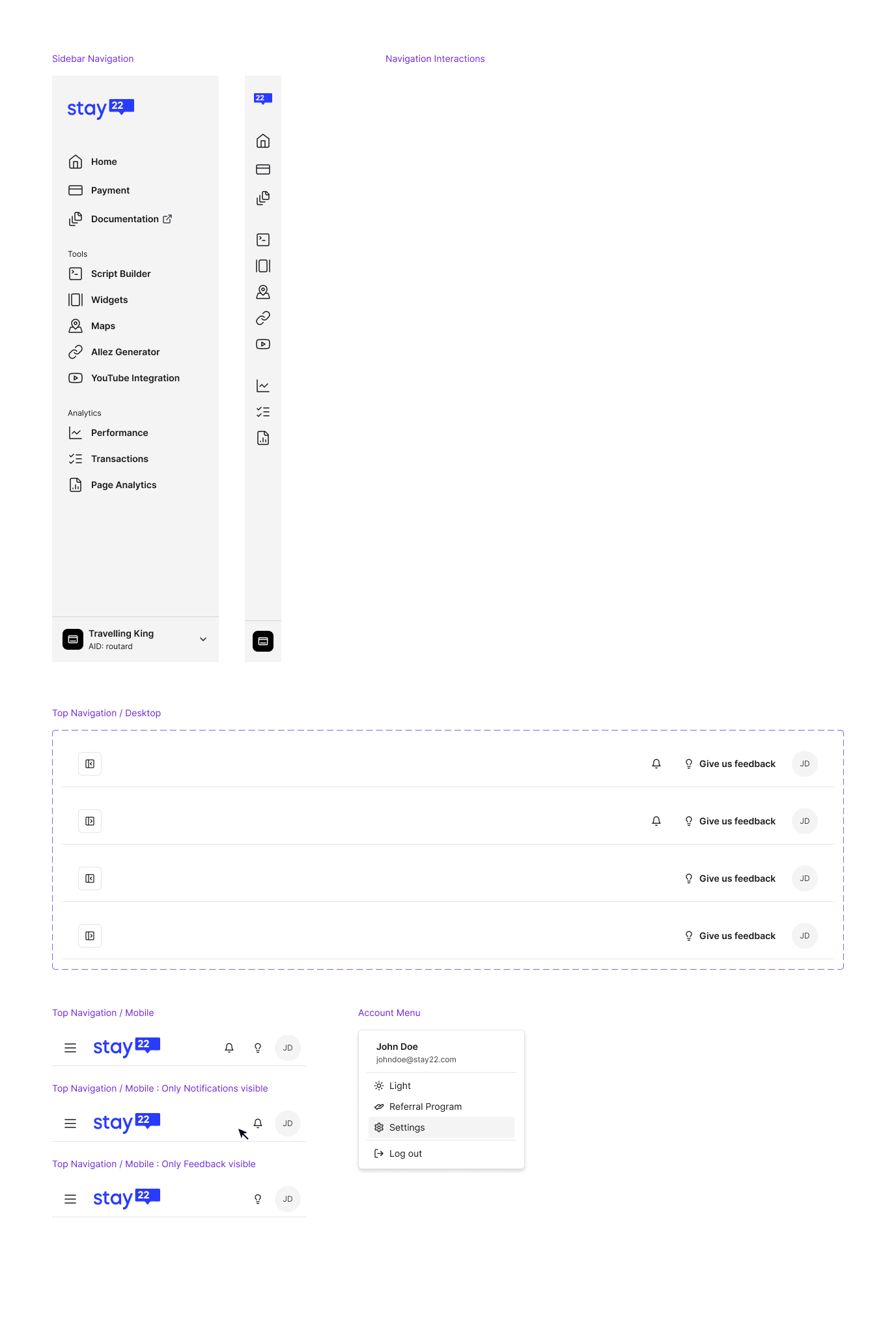
Desktop Navigation
A scalable left nav with clear grouping, plus a collapsed rail for focus and density.
Sidebar hierarchy with grouped sections and an anchored account switcher.
OpenMobile Navigation
A top bar plus drawer menu that keeps key actions reachable without sacrificing content space.
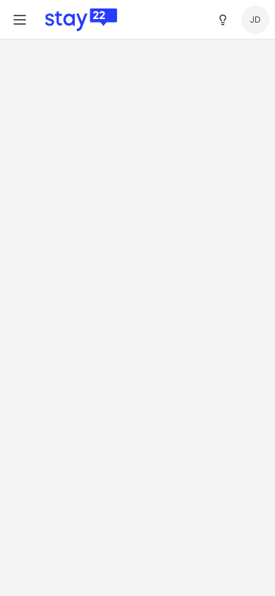
Mobile header pattern for navigation + account access.
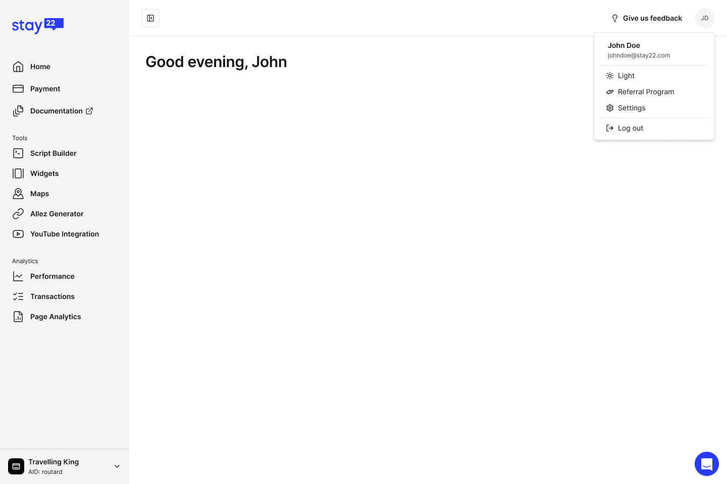
OpenAccount Menu
A consistent account menu for preferences and account-level actions.
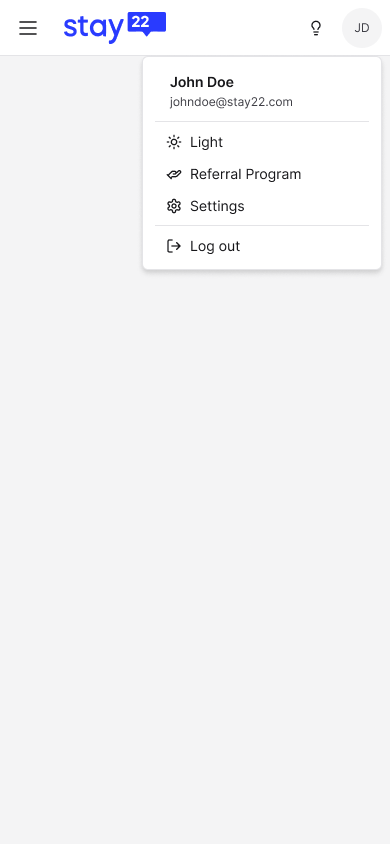
Account menu actions with a clear, compact layout.
OpenOutcomes
- Established a scalable navigation system for the new dashboard rollout as part of a broader design-system migration.
- Improved learnability through consistent grouping, iconography, and theme parity across desktop and mobile patterns.
- Enabled dense workflows with a user-driven collapsed rail while keeping full navigation one click away.
Screens shown as design work samples. Product details may be simplified.