Performance Analytics
Stay22 · New dashboard rollout (stealth release) · 2025
A performance analytics view that combines filters, KPI cards, and a multi-series chart to help partners understand how maps and affiliate links perform over time—built with light/dark parity and responsive layouts.
Problem
Partners need a reliable feedback loop for content performance: what’s being loaded, viewed, interacted with, clicked, and transacting. The UI needed to support quick scanning and deeper inspection while keeping definitions clear and behavior consistent across devices and themes.
Users
Stay22 affiliate partners monitoring engagement and conversion signals across their content, often filtering by timeframe and campaign IDs.
Approach
- Anchored filters (date range + campaign IDs) at the top to support drill-down without hiding controls.
- Used KPI cards with short definitions so metrics are understandable without documentation.
- Designed a multi-series bar chart with tooltip details to enable inspection without clutter.
- Delivered responsive and light/dark parity as part of the dashboard redesign migration.
Desktop Experience
Filters + KPI definitions + multi-series trend chart, optimized for scanning and analysis.
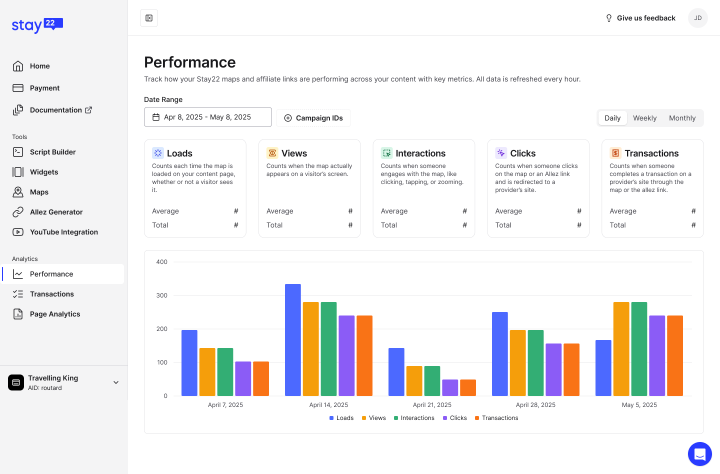
Scan-first layout with filters, KPIs, and trends.
OpenMobile Experience
A vertical flow that keeps filters usable and trends readable on small screens.
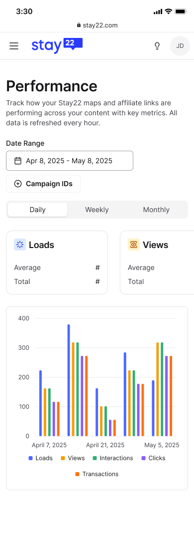
Mobile layout prioritizing filters and key metrics.
OpenOutcomes
- Delivered a performance analytics surface that supports quick scanning and deeper inspection of key metrics.
- Improved metric comprehension via KPI definitions and consistent aggregation controls.
- Maintained responsive behavior and light/dark parity as part of the dashboard redesign migration.
Screens shown as design work samples. Product details may be simplified.