Making Travel Choices Easier: UX, Booking, and Helping You Earn More
Introduction
I'm always searching for ways to make online travel booking easier and more profitable for our partners. If you've ever felt overwhelmed by too many hotel options and just gave up, you're not alone. Let's dive into the world of online bookings, understand why sometimes less is more, and how we can earn more with the right choices.
Why Too Many Choices Can Be a Bad Thing
Think about the last time you tried to pick a movie to watch from a massive list. Frustrating, right? That's because when we have too many choices, we sometimes end up choosing nothing. Psychologists Sheena Iyengar and Mark Lepper studied this, discovering that more options can mean fewer sales. We see this in the travel world too.
Hick's Law:The time it takes to make a decision increases with the number and complexity of choices. This law means when faced with too many hotel options, users can feel overwhelmed and take longer to decide or not decide at all.
Making Choice Work for Us
It's not just about providing a ton of hotel options; it's about offering the right ones. Imagine a music playlist curated just for you versus a random list of songs. That's what we aim for: a tailored experience for users, which also means more bookings for our partners.
Prägnanz's Law:People will perceive and interpret ambiguous or complex images as the simplest form possible. In our context, a well-organized, clean, and simple list of hotels is more appealing and easier to understand for users than a messy, overloaded one.
Getting the Balance Just Right
Too many options? Bad. Too few options? Also not ideal. We need to hit the right balance. By offering a tailored, not overwhelming list of hotels, we can help users quickly find what they're looking for.
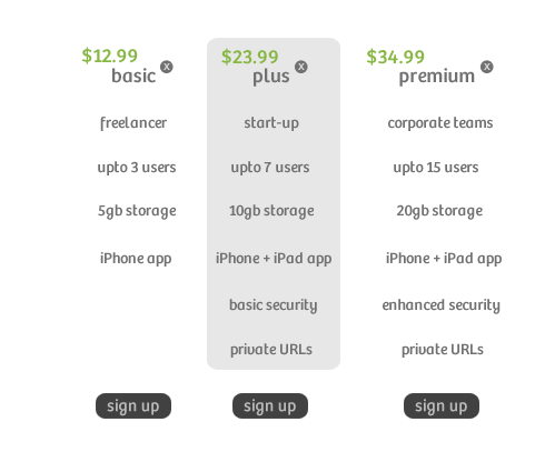
Law of Common Region:Elements that are grouped together are perceived as a single unit. By categorizing hotel options effectively, users can quickly understand and pick what suits them best.
Making Bookings Look Good and Easy
- Clean and Simple: Get rid of distractions and showcase a neat list of options that's easy on the eyes.
- Easy Categories: Like having different sections in a store, clear categories help users quickly find what they're after.
- Not Too Many Choices: Offer a few good options rather than a barrage of choices. This ties back to Hick's Law mentioned earlier.
- Ratings and Reviews: Just like asking friends for recommendations, showing popular choices and user feedback can boost user confidence.
- Quick Booking: Once users choose, the booking process should be smooth and hassle-free.


When two design elements are in conflict, the simplest will dominate. This means a straightforward booking process without confusing elements will always win users over.
Quality over quantity. That's the name of the game. It's about making the search process as simple and efficient as possible. Using the Laws of UX, we can design a system that offers the right choices without overwhelming users. In a world full of choices, our goal is to make travel booking decisions quick, easy, and profitable for everyone involved.